Using the 960 Grid System
I recently created a website using the 960 Grid System. It let’s you create a grid-based layout with ease but also offers enough freedom. In this post I’ll show you how to use 960gs.
The 960gs has a 12-column, 16-column and 24-column mode. For my website 12 columns were sufficient.
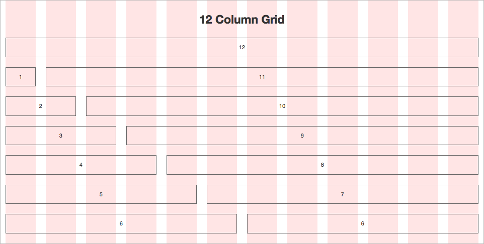
960gs is based on a page-width of, like the name says, 960px. In the above image you can see all posible coulmn-sizes. Each Column has a width of 60px (in the 16-column system it’s 40px) and a margin on both sides of 10px. To get started, include this line into your head-section of your html:
<link rel="stylesheet" type="text/css" media="all" href="css/960.css" />
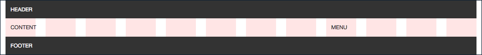
A simple layout could look like this:
<div class="container_12">
    <div class="grid_12">
        HEADER
    </div>
    <div class="clear"></div>

    <div class="grid_4">
        MENU
    </div>
    <div class="grid_8">
        CONTENT
    </div>
    <div class="clear"></div>

    <div class="grid_12">
        FOOTER
    </div>
</div>
If you want to remove the padding you can use the css-classes alpha and omega.
So let’s say we want to remove the padding between MENU and CONTENT you will have to add the class omega to MENU (omega removes the padding at the end of the column) and add the class alpha to CONTENT (alpha removes the padding at the beginning of the column).
<div class="container_12">
    <div class="grid_12">
        HEADER
    </div>
    <div class="clear"></div>

    <div class="grid_4 omega">
        MENU
    </div>
    <div class="grid_8 alpha">
        CONTENT
    </div>
    <div class="clear"></div>

    <div class="grid_12">
        FOOTER
    </div>
</div>
A nice feature of 960gs are the push and pull classes. Let’s say we want our MENU on the right side, but appear first in the sourcecode. We can achieve this like this:
<div class="container_12">
    <div class="grid_12">
        HEADER
    </div>
    <div class="clear"></div>

    <div class="grid_4 push_8">
        MENU
    </div>
    <div class="grid_8 pull_4">
        CONTENT
    </div>
    <div class="clear"></div>

    <div class="grid_12">
        FOOTER
    </div>
</div>
If you don’t want to be fixed to 960px width I strongly recomend using the Variable Grid System. It basically generates a custom 960gs for you.